Overall Team Production 2 was a much more trying class than Team Production 1 was the previous quarter. As much as I would have loved to devote many more hours into the project as I did with TP 1, between 5 other classes (Including a portfolio class) and work, there was just not enough time to be had and truth be told I feel the game suffered some from it.
That being said, I am definitely proud of what I did get done, and the progression from more modular and static pieces to character development was exciting and a nice change of pace for me.
Again the challenges of working within a team environment were well balanced with the more positive aspect of being able to work with some of the most talented individuals at the school.
Both TP1 and TP2 were definitely huge learning experiences for me, as an artist
and team member and on both the technical and artistic levels. An in all
ways I feel stronger having gone through the whole experience. Whereas the last quarter the challenge centered around the unexpected hurtles of designing just so, so many small
asset - the main challenge from this quarter was integrating the more alienesque aspects of the game into what we already had; a nice little pony meadow environment.
Overall I think everything as well incorporated and even with the dramatic differences in looks of the two characters I created, they still seem like they could be from the same game world.
As I stated before this class was a great learning experience and with
my peers and team members I am extremely happy to see everything we got done in just two short quarters.
A process blog following Kirkpatrick Edmond's contributions to a Team Production project.
Monday, June 11, 2012
Monday, May 14, 2012
Monday, May 7, 2012
Hive Mind Update
Below is the mesh Ron gave me and t I started with before tweaking the model to my satisfaction.
This is some work I did earlier in the week, a paintover I did of the original model done by Ron, which is also pictured below.
Monday, April 30, 2012
Colt
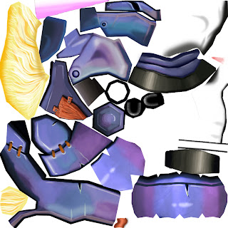
Colt texture sheet: 1024x1024

Made some early tweaks to the model as was given to me. Ended up making a few more changes from what are seen here in the form of hoofs instead of hands and a changed mane.
Monday, April 16, 2012
House Update
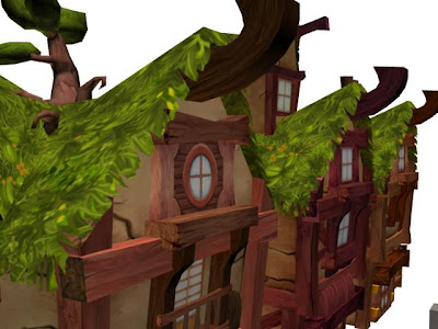
Finally got alphas on the houses to finish off their look and feel. Had some problems getting them into the game engine but with some tweaking and discovery of how to tile a material within the UDK worked out fine.

Monday, April 9, 2012
Windmill Asset
First development update since the end of Team Production 1. The windmill was an asset we wanted to develop for the first quarter but never got to it - so it became one of the first assets developed for TP2 as we move away from the village and onto the alien assets. Re-utilized a lot of textures from the village but felt it was important to do so as it was still supposed to fit within the same environment.Modeled by Ron, Unwrapped/Textured by me.
Texture 1024x1024
Wednesday, March 21, 2012
Reflection on Team Production 1
Overall this was an awesome learning experience. The challenges of working within a team environment were well balanced with the positive aspects of working with some top notch individuals such as my partner Ron. In this case It was extremely helpful in a surprising way to work with a teammate who has strengths opposite of my own in the fact he is a stronger modeler while I am more adept in texturing and Photoshop.
I am extremely happy with how contributions to the class came out. From concept to finalized asset within the game itself - I could not be more pleased. This was definitely a learning experience for me, as an artist and team member and on both the technical and artistic levels. An in all ways I feel stronger having gone through the whole experience. It was certainly challenging and I never expected creating so many small assets would be so difficult or time consuming but with the hefty amount of time I put into the class this quarter and with the finalized parts now realized, I feel confident it all paid off.
Especially with the knowledge we are only 50% done with the class (Team Production 1) and still have all of Team Production 2 to finish our vision for a game we can all be proud of.
Some specifics of how I feel I improved are as follows:
As I stated before this class was a great learning experience and with my peers and team members I am extremely excited to see everything we can get down with another full quarter before us.
I am extremely happy with how contributions to the class came out. From concept to finalized asset within the game itself - I could not be more pleased. This was definitely a learning experience for me, as an artist and team member and on both the technical and artistic levels. An in all ways I feel stronger having gone through the whole experience. It was certainly challenging and I never expected creating so many small assets would be so difficult or time consuming but with the hefty amount of time I put into the class this quarter and with the finalized parts now realized, I feel confident it all paid off.
Especially with the knowledge we are only 50% done with the class (Team Production 1) and still have all of Team Production 2 to finish our vision for a game we can all be proud of.
Some specifics of how I feel I improved are as follows:
- My organic drawing and Photoshop abilities.
- Concept work and development of ideas for a cohesive game look and feel.
- Technical knowledge about both 3ds Max and the use of Material IDs and how they correlate with naming conventions into the UDK.
- Became better acquainted with Mudbox sculpting tools and maps rendering.
- Becoming a stronger team player/ experience working in a team environment/ solving issues and glitches that arise in the team production pipeline.
As I stated before this class was a great learning experience and with my peers and team members I am extremely excited to see everything we can get down with another full quarter before us.
Sunday, March 18, 2012
Near Finished Houses
Obviously they need some more work and the inclusion of a few more spec maps for the glass windows as well as alphas for the grass fringe on the roof but for now they are well enough on their way for Team Production 1.
Saturday, March 17, 2012
House Progress
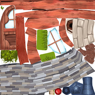
Progress on house assets. Tried to maximum use of previously created tileable textures with only 1 unique asset sheet. Sticking to original concepts as closely as possible for shape and playing with the color as I go.

Monday, March 12, 2012
Forge Progress
Modeled by Ron and unwrapped by me, this is the forge model.
Near finished textured forge. Still debating the use of stone on the base and the alphas need to be tweaked a bit but this is fairly close to the end result - minus props (hammer, anvil, ect.)

Texture sheet for the unique assets on the forge building. Used two separate material IDs for this asset so I could use the tillable grass texture I showed earlier in the blog for the roof.

Wednesday, March 7, 2012
More Assets
Keeping with the concept and adding more to further flush out the village look here are some more assets to populate the area:
Textured assets: The entrance gate with a scale reference, water and hay troughs and an empty food stand, a flushed out and unfinished stump, a barrel, a fence, and different hay bale variations with no alphas on them yet.
Had fun texturing and designing the assets, went with a different look and style for the fences as I thought the old ones we had were to flat and boring so tried to make them more a mix of stone and wood features that also emulate the gate to the village. As far as colors and textures go I used some of the same styles found in the statue area and played with wood color trying to make the food stands darker red. Some still need to be tweaked and flushed out with alphas and extra details.
Texturing Progress for Statue Area
The main focus after completing the modeling was to get to work defining look for the textured assets in the village. Here is a final screen cap of textures for the statue area.
Struggled a lot with the horse statue itself. I knew from the beginning that I wanted the statue to look like it was comprised of multiple pieces and I modeled it accordingly. The hard part was since it was the first textured asset in the scene, I just could not get the look of it right, it started out very grey and muted. But after working out a few of the other textures like the rocks and deciding on the multicolored stone base for the statue area I tweaked the horse texture itself to a more contrasted and sand stone color, which is what you see now.
Here are my texture sheets used for the scene. Large scale (statue, base) are 1024x1024 and the rest are 512x512.
Subscribe to:
Comments (Atom)


